Online Manual
Charts & Visualizations
The Charts feature generates pie charts from your Active Directory data, giving you a visual overview of account status, logon activity, password health, and group distribution. This is a Pro feature.
Accessing Charts
Click CHARTS in the sidebar to open the charts view.
Available Data Sources
Select a data source from the dropdown to define what the chart will show. AD FastReporter includes these pre-configured chart types:
| Data source | What it shows |
|---|---|
| User accounts created | Distribution of user account creation dates |
| Computer accounts created | Distribution of computer account creation dates |
| Groups created | Distribution of group creation dates |
| User accounts status | Enabled vs. disabled user accounts |
| User activity (last logon) | When users last logged on (recent, 30+ days, 90+ days, never) |
| Last password change | Distribution of when passwords were last changed |
| Have password expiration date | Accounts with vs. without password expiration |
| Can change passwords | Accounts that can vs. cannot change their own password |
| Can login without a password | Accounts with vs. without password requirements |
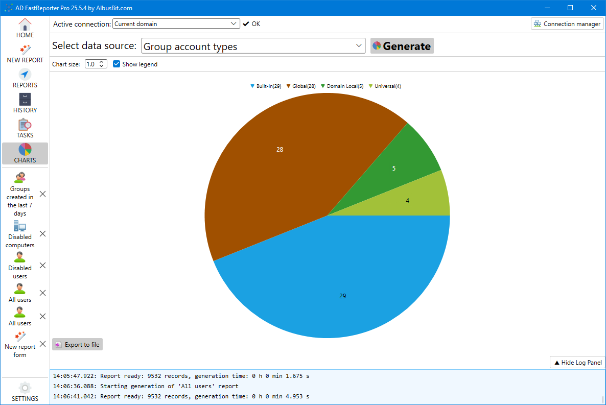
| Group account types | Distribution of group types (security vs. distribution, by scope) |
Generating a Chart
- Select a data source from the dropdown
- Click Generate
- AD FastReporter queries your Active Directory using the currently selected connection, processes the data, and renders the chart
Generation time depends on the size of your directory. For large environments, chart generation may take a minute or more as it needs to read the relevant attributes for all objects of the selected type.
Progress is shown in the log panel during generation. You can click Stop to cancel.
Chart Display Options
After the chart is generated:
- Chart size — Use the slider to adjust the size of the pie chart
- Show legend — Toggle the legend display on or off
Each pie segment is labeled with its category name and the count of objects in that category. Percentages are calculated automatically.
Exporting Charts
Click Export to file to save the chart as an image. Supported formats:
- PNG (recommended for most uses)
- JPG / JPEG
- BMP
- GIF
- TIFF
Exported charts can be included in presentations, compliance documentation, or management reports.
Use Cases
Charts are useful for getting a quick visual snapshot of your AD environment. For example, a “User accounts status” chart immediately shows the ratio of enabled to disabled accounts. A “User activity (last logon)” chart highlights how many accounts are stale. A “Group account types” chart shows the balance between security and distribution groups.
For detailed data and individual records, use the regular report generation workflow. Charts complement reports by providing the high-level picture.